A non-contiguous area cartogram – a mouthful of a term – is a concept of displaying two pieces of information in a single chorpoleth map.
One piece of information is carried by color of polygons (typically administrative units) and the other by rescaling the size of the polygons compared to their original, contiguous, placement.
This style of visualization has been popularized in US political reporting, where great disparity exists between densely populated urban areas, and less populated, but optically large, rural areas.
A number of data visualizations has been circulated, variously exploiting, and debunking, this disparity. Famously egregious example being the “Try to impeach this” tweet by Lara Trump.
— Lara Trump (@LaraLeaTrump) September 28, 2019
Rescaling administrative areas by population (or total votes cast) is one of the tools that can be used to give some context to the US political map.
Rescaling is a relatively uncomplicated affine transformation, one that is well implemented in the context of {sf} package.
To make it even more easy to use I propose a function, st_rescale() that takes two arguments:
dataexpected as a {sf} format data frame with a geometry columnscaling_factora numerical vector of scales. It works best with scaling factors between 0 and 1, but it is not strictly required.
The function returns rescaled geometry, implemented in the same coordinate reference system as used by the spatial object provided in the data parameter.
library(sf)
library(dplyr )
library(ggplot2)


st_rescale <- function(data, scaling_factor) {

  # be careful with that recycling!
  if (length(scaling_factor) > 1 & length(scaling_factor) != nrow(data)) {
    stop("data & scaling factor of incompatible lenghts")
  }

  # take the geometry out...
  geometry <- sf::st_geometry(data)

  # magic!:)
  scaled_geometry <- (geometry - sf::st_centroid(geometry)) *
    scaling_factor + sf::st_centroid(geometry)

  # turn the scaled geometry to {sf} object
  scaled_data <- sf::st_as_sf(scaled_geometry, crs = sf::st_crs(data))

  # and return it back
  scaled_data
}
Rescaling works on sfc level (the geometry column alone). It the proposed function it involves first subtraction of centroid coordinates, then multiplication of the geometry by the scaling factor, and lastly adding back the centroid coordinates. This ensures that the centroid of the rescaled polygon will be the same as the centroid of the original one.
To demonstrate the technique I will “borrow” the file of 2016 Pennsylvania election results used by Sharon Machlis in her article How to create an election map in R published on InfoWorld website.
As there is a slight mismatch in naming conventions between the csv file and county names in the {tigris} package, which is the authoritative source of US administrative area polygons, I am converting county names in both datasets to uppercase.
pa_data <- readr::read_csv("pa_2016_presidential.csv") %>%
  mutate(votes_cast = Clinton + Trump,
         PctMargin = PctMargin * ifelse(Winner == "Trump", 1, -1),
         County = toupper(County)) # uppercase to smoothen the join

pa_shape <- tigris::counties(state = 'PA', resolution = '20m') %>%
  mutate(County = toupper(NAME)) # uppercase to smoothen the join

chrt_src <- pa_shape %>%
  inner_join(pa_data, by = c("County" = "County"))
The first visualization is a classic choropleth map - each county painted in a shade of red & blue proportional to the margin of victory of Trump vs. Clinton.
In this viz Pennsylvania transforms into a sea of red color, interrupted by two blue spots. What the map does not make immediately obvious is that the two blue spots are Philadelphia and Pittsburgh, and that the sea of red is mostly void.
ggplot() +
  geom_sf(data = chrt_src, aes(fill = PctMargin),
          color = "gray75", size = .15) +
  scale_fill_gradient2(low = 'blue',
                       high = 'red') +
  labs(title = 'Pennsylvania 2016; plain vanilla choropleth',
       fill = 'Margin') +
theme_void() 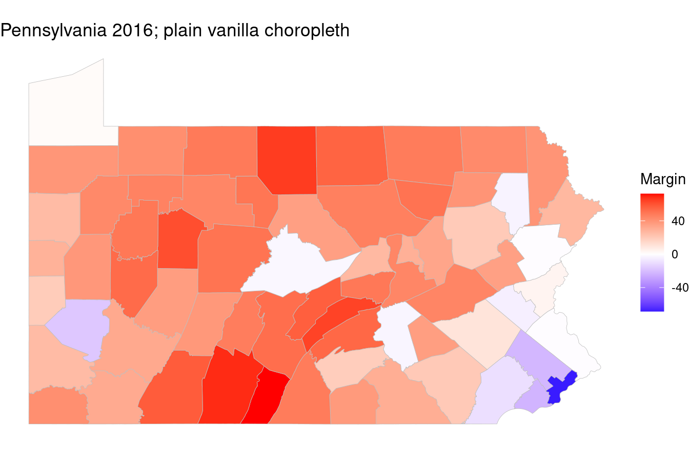
As an alternative I propose another map, one where the county polygons are rescaled in proportion of total votes cast. The original county lines are kept in grey to give some idea by how much was the polygon shrunk.
This alternative map gives more prominence to the two metropolitan areas, and visually shrinks the rural counties. The deeply red Potter County close to the NY border, where 7,553 votes were cast – compared to 692,773 in much smaller Philadelphia – disappears almost entirely.
# rescale PA counties by total of votes cast
chrt_src_rescaled <- chrt_src %>%
  st_rescale(chrt_src$votes_cast / max(chrt_src$votes_cast))

ggplot() +
  # rescaled polygons with fill
  geom_sf(data = chrt_src_rescaled, aes(fill = chrt_src$PctMargin),
          color = "gray75", size = .15) +
  # original county boundaries for context as outline
  geom_sf(data = chrt_src, fill = NA, color = "gray75", size = .15) +
  scale_fill_gradient2(low = 'blue',
                       high = 'red') +
  labs(title = 'Pennsylvania 2016; counties rescaled by total votes cast',
       fill = 'Margin') +
theme_void() 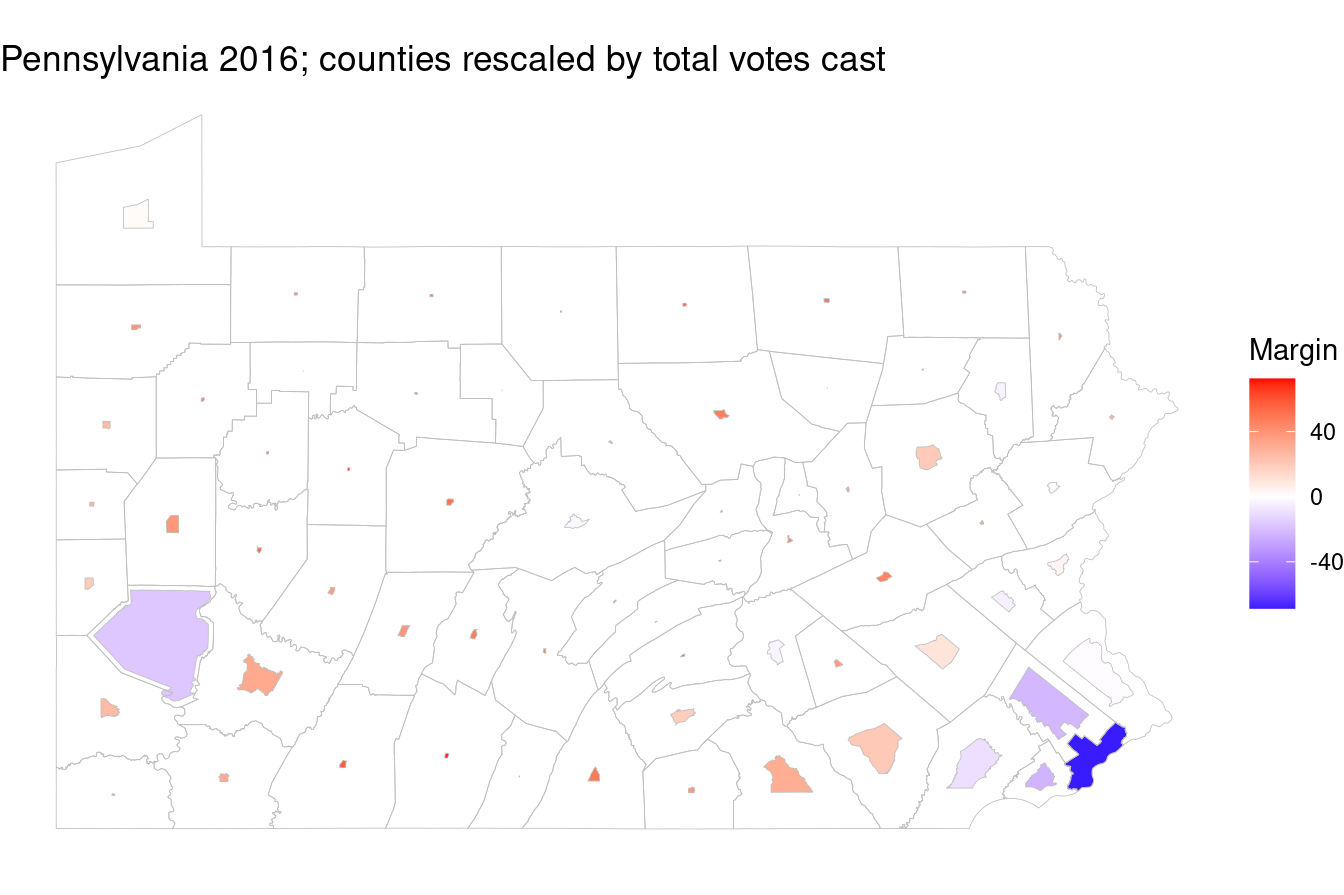
I believe my demonstration has shown a possible approach to encoding two pieces of information, namely margin of victory of a politician per administrative unit, and the size of voting population of the said administrative unit.