Optimizing branch presence is a common activity in marketing. In this blog post I propose a R centered workflow for this task.
While the “problem” of optimizing locations of Prague bars is meant only half seriously, the case study uses real world data and shows the ease with which R can be used as a tool enabling more serious work.
The main steps taken are the following:
- exploring the point data (location of bars in Prague)
- creating an equal distance grid covering the City of Prague
- assigning target and feature variables (population, visitors, metro stations) to the grid cells
- fitting a model predicting the number of bars accoding to the feature variables
- visualizing residuals - difference between observed and modeled count of bars per cell
Getting the Bars Data in
I am using an existing CSV file, listing names and coordinates of all Prague bars. The file can be downloaded by running code from the block below.
Comparable results could be obtained from R via either Google Places API via googleway::google_places() and / or OpenStreetMap API via osmdata::osmdata_sf().
library(tidyverse) # mainly ggplot & dplyr
library(RCzechia)  # spatial objects of the Czech Republic
library(scales)    # aligned with tidyverse, but not a part of the core
library(units)     # for handling area units (square kilometers)
library(sf)        # spatial vector data operations package

# directory for source data files
network_path <- 'http://www.jla-data.net/ENG/2019-01-14-optimizing-prague-bar-network_files/'

tf_bars <- tempfile(fileext = ".csv") # create a temporary csv file
download.file(paste0(network_path, 'prague_bars.csv'), tf_bars, quiet = T)
bars <- read.csv(tf_bars) # read the bar data in
Additional Spatial Objects
To present the Prague bars in a broader context I am also displaying a polygon representing the borders of the City of Prague and a polyline of the part of Vltava river passing through the city. Both spatial objects come from package RCzechia, which can be installed from CRAN.
During this exercise, and later when creating the grid and filling it with data, I will frequently switch between two coordinate reference systems:
- spherical EPSG:4326, which is the familiar degree based WGS84 used by GPS, Google and many others
- planar EPSG:5514 by ing. Křovák, which is the official Czech CRS and has eastings and northings in meters
The spherical coordinates are ubiquitous and are handy for visualization using standard packages, but for operations involving distance or area only a metric CRS will do.
obrys <- RCzechia::kraje("high") %>% # all the Czech NUTS3 entities ...
  filter(KOD_CZNUTS3 == 'CZ010') %>% #  ... just Prague
  select(geometry) %>% # only the boundaries (no data)
  st_transform(5514) # to a metric CRS (for the buffer to work)

bbox <- obrys %>%
  st_buffer(1000) # 1 kilometer buffer

obrys <- st_transform(obrys, 4326) # back to WGS84

vltava <- RCzechia::reky() %>% # all the Czech rivers ...
  filter(NAZEV == 'Vltava') %>% # ... the one relevant
  st_transform(5514) %>% # to a metric CRS
  st_intersection(bbox) %>% # clip to the box around Prague
  st_transform(4326) # back to WGS84
Initial Overview
Having downloaded the bar location data, and prepared the other spatial objects to give them necessary context, I draw a simple scatterplot. This is the exploratory phase, and a basic ggplot2 chart will do.
ggplot() +
  geom_point(data = bars, aes(x = lon, y = lat), pch = 4, alpha = 0.7, col = "red") +
  geom_sf(data = vltava, color = 'slategray3', lwd = 1.25) +
  geom_sf(data = obrys, fill = NA, color = 'gray75', lwd = 1, alpha = 0.6) +
  theme_bw() +
  theme(axis.title.y = element_blank(),
        axis.title.x = element_blank())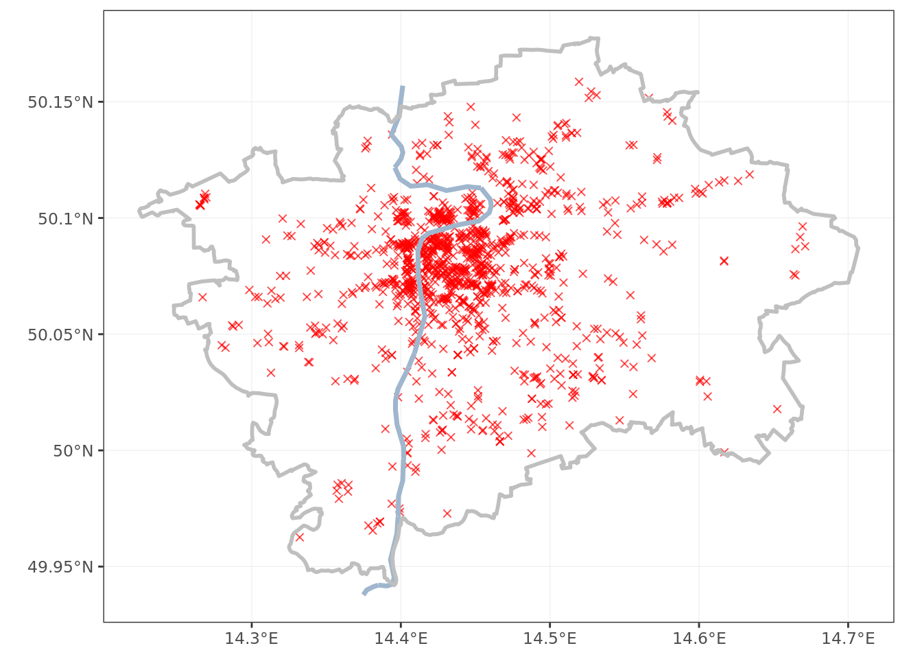
The bars in Prague seem to follow a roughly octopus shape - a big cluster in the center, with tentacles spreading to the outskirts.
With a little local knowledge (there is a reason I am picking this city :) I can tell that the tentacles seem to follow the metro lines.
The points in the city center overlap greatly; a density plot gives better understanding of the situation.
ggplot() +
  stat_density_2d(data = bars, aes(x = lon, y = lat, fill = ..level..),
                  geom = "polygon", alpha = .15, color = NA) +
  scale_fill_gradient2("Bars", low = "white", mid = "yellow", high = "red") +
  geom_sf(data = vltava, color = 'slategray3', lwd = 1.25) +
  geom_sf(data = obrys, fill = NA, color = 'gray75', lwd = 1, alpha = 0.6) +
  theme_bw() +
  theme(axis.title.y = element_blank(),
        axis.title.x = element_blank(),
        legend.text.align = 1)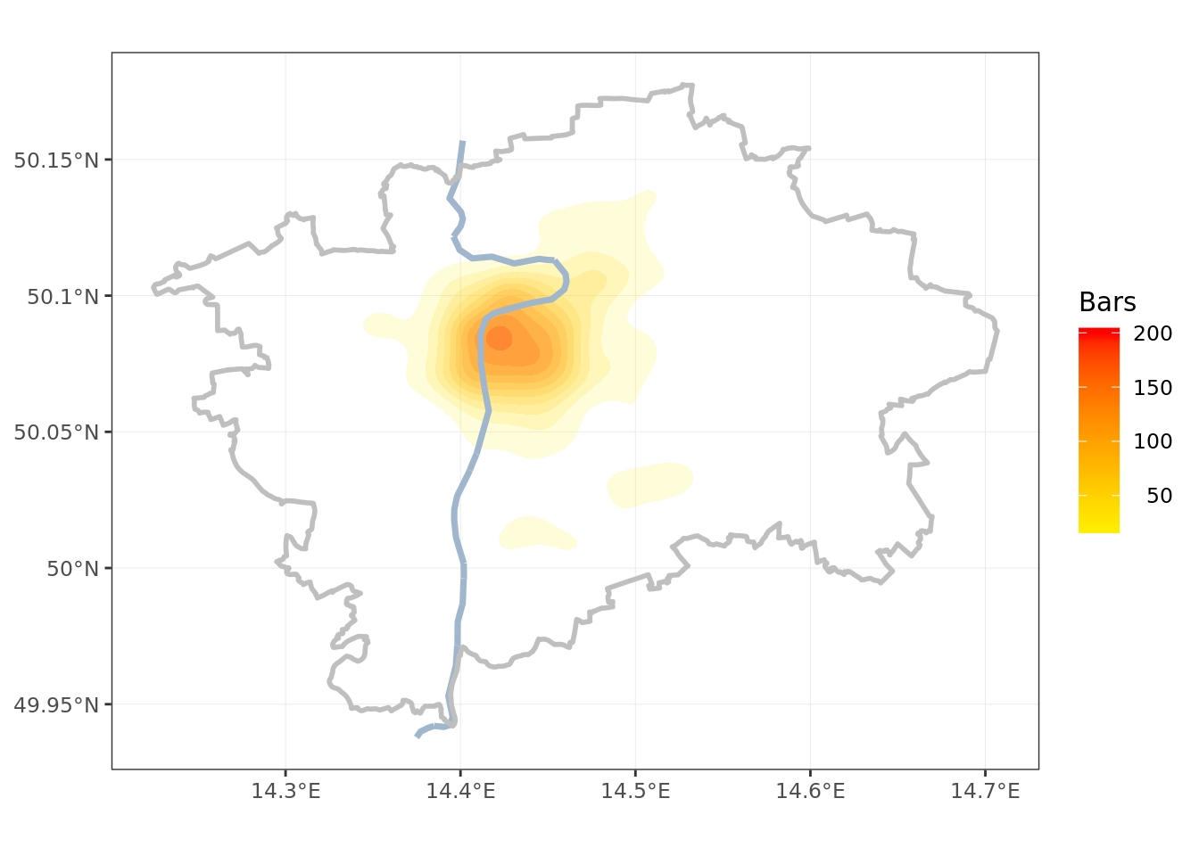
Creating Equal Distance Grid
The appropriate size of grid cells can be adjusted as required. For the purpose of my exercise I am setting the cell area to two square kilometers. This will make a grid of 322 cells.
When creating the grid via sf::st_make_grid() it is necessary that my underlying spatial object is in a planar CRS (meaning WGS84 will not do).
# size of squares, in units of the CRS (i.e. meters for 5514)
grid_spacing <- 1000*sqrt(2)

obrys <- st_transform(obrys, 5514) # temporarily transform to a metric CRS

krabicka <- st_bbox(obrys)

xrange <- krabicka$xmax - krabicka$xmin
yrange <- krabicka$ymax - krabicka$ymin

# count the polygons necessary & round up to the nearest integer
rozmery <- c(xrange/grid_spacing , yrange/grid_spacing) %>%
  ceiling()

grid <- st_make_grid(obrys, square = T, n = rozmery) %>% # make the grid
  st_intersection(obrys) %>% # clop the inside part, as a sfc object
  st_transform(4326) %>% # convert to WGS84
  st_sf() %>% # make the sfc a sf object, capable of holding data
  mutate(id = row_number()) # create id of the grid cell

obrys <- st_transform(obrys, 4326) # back to WGS84

ggplot() +
  geom_sf(data = grid, fill = NA, color = 'gray50', alpha = 0.6) +
  geom_sf(data = vltava, color = 'slategray3', lwd = 1.25) +
  geom_sf(data = obrys, fill = NA, color = 'gray75', lwd = 1, alpha = 0.6) +
  theme_bw() +
  theme(axis.title.y = element_blank(),
        axis.title.x = element_blank())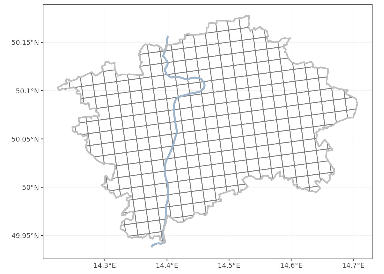
The grid looks somewhat twisted. This is an expected output, as the Křovák projection is by design not aligned with north on top. The reasons for that are historical, and not really relevant for this exercise. The important thing is that the grid is spaced evenly, and each grid cell (except for the edge ones) has area of 2 km².
Having prepared the grid I join it to the data frame of bars, and count the totals per grid cell.
bars <- bars %>% # convert to a sf object
    st_as_sf(coords = c("lon", "lat"),
           crs = 4326, agr = "constant")

pruseciky <- st_join(bars, grid) %>%
  st_set_geometry(NULL) %>%
  group_by(id) %>%
  tally() %>%
  select(id, barcount = n)

grid <- left_join(grid, pruseciky, by = 'id') %>%
  mutate(barcount = ifelse(is.na(barcount), 0, barcount)) # replace NAs with zero

ggplot() +
  geom_sf(data = grid, aes(fill = barcount), color = 'gray50', alpha = 0.6) +
  scale_fill_gradient2(midpoint = 30,
                       low = 'green2',
                       mid = 'yellow',
                       high = 'red3',
                       na.value = 'white',
                       name = 'bar count') +
  geom_sf(data = vltava, color = 'slategray3', lwd = 1.25) +
  geom_sf(data = obrys, fill = NA, color = 'gray75', lwd = 1, alpha = 0.6) +
  theme_bw() +
  theme(axis.title.y = element_blank(),
        axis.title.x = element_blank(),
        legend.text.align = 1)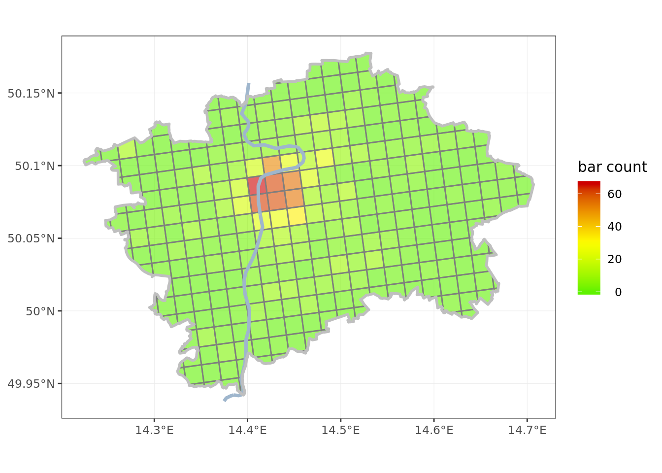
Feature data
After an extensive fielwork investigating the Prague bars and their patrons I decided on three features for my model:
- local population, using data from the latest census in 2011, by the Czech Statistical Office
- foreign visitors, using as proxy number of hotel beds as of 2017, also by the Statistical Office
- metro stations, using a GeoJSON from Prague City open data portal
The data sets were lightly edited for size, and can be downloaded by running code below.
tf_czso <- tempfile(fileext = ".csv") # creae a temporary csv file
download.file(paste0(network_path,'CZSO_data.csv'), tf_czso, quiet = T)
czso <- read.csv(tf_czso) # read the Czech Statistic Office data

tf_metro <- tempfile(fileext = ".geojson") # a temoprary geojson
download.file(paste0(network_path,'metro_stations.geojson'), tf_metro, quiet = T)
metro <- st_read(tf_metro, quiet = T) # read the metro stations
Metro stations are points, and easy to assign to grid cells directly. The population and hotel beds are more tricky, as they are reported for administrative districts (Prague has 57 of these).
Assigning values per district to the grid cells required making an assumption of equal density of the metric across a district; then it was easy to assign the metric according to the proportion of area of district intersecting each grid cell.
prazske_casti <- RCzechia::casti() %>% # shapefile all borroughs of Czech cities
  filter(NAZ_OBEC == 'Praha') %>% # Prague ones
  mutate(cast = as.numeric(KOD)) %>% # keys in RCzechia are character
  inner_join(czso, by = 'cast')

# transform to a metric CRS (for area measurement)
prazske_casti <- st_transform(prazske_casti, 5514)
grid <- st_transform(grid, 5514)

prazske_casti$pr_area <- st_area(prazske_casti) # total area of the borrough

# create a temp structure for calculating the population & beds per grid cell
asdf <- prazske_casti %>%
  # intersection of borrough and grid cell - there will be partial intersections
  # (there will be more rows of intersections than of grid cells)
  st_intersection(grid) %>%
  select(id, pr_area, pop, beds)

asdf$in_area <- drop_units(st_area(asdf)) # area of intersection of borrough & grid cell

asdf <- asdf %>%
  st_set_geometry(NULL) %>%
  mutate(pop = pop * in_area / pr_area,  # share of metric as proportion of area
         beds = replace_na(beds * in_area / pr_area, 0)) %>%
  group_by(id) %>% # group by cell id
  summarise(pop = drop_units(sum(pop)), # totals per grid cell
            beds = drop_units(sum(beds)))

grid <- left_join(grid, asdf, by = 'id') # attach the temp structure

grid <- st_transform(grid, 4326) # back to WGS84

# count metro stations per grid cell & attach
pruseciky <- st_join(metro, grid) %>%
  st_set_geometry(NULL) %>%
  group_by(id) %>%
  tally() %>%
  select(id, stations = n)

grid <- left_join(grid, pruseciky, by = 'id') # now the grid information is complete!

ggplot() + # plot population
  geom_sf(data = grid, aes(fill = pop), color = 'gray50', alpha = 0.6) +
  scale_fill_gradient2(low = 'green2',
                       mid = 'yellow',
                       high = 'red3',
                       na.value = 'white',
                       name = 'population',
                       labels = comma) +
  geom_sf(data = vltava, color = 'slategray3', lwd = 1.25) +
  geom_sf(data = obrys, fill = NA, color = 'gray75', lwd = 1, alpha = 0.6) +
  theme_bw() +
  theme(axis.title.y = element_blank(),
        axis.title.x = element_blank(),
        legend.text.align = 1)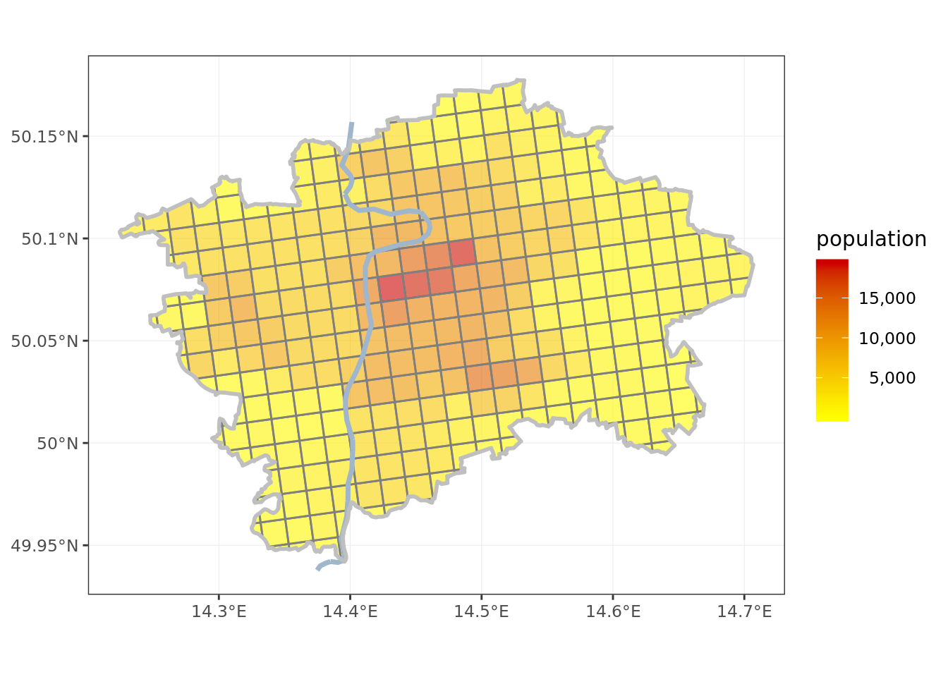
ggplot() + # plot hotel beds
  geom_sf(data = grid, aes(fill = beds), color = 'gray50', alpha = 0.6) +
  scale_fill_gradient2(low = 'green2',
                       mid = 'yellow',
                       high = 'red3',
                       na.value = 'white',
                       name = 'hotel beds',
                       labels = comma) +
  geom_sf(data = vltava, color = 'slategray3', lwd = 1.25) +
  geom_sf(data = obrys, fill = NA, color = 'gray75', lwd = 1, alpha = 0.6) +
  theme_bw() +
  theme(axis.title.y = element_blank(),
        axis.title.x = element_blank(),
        legend.text.align = 1)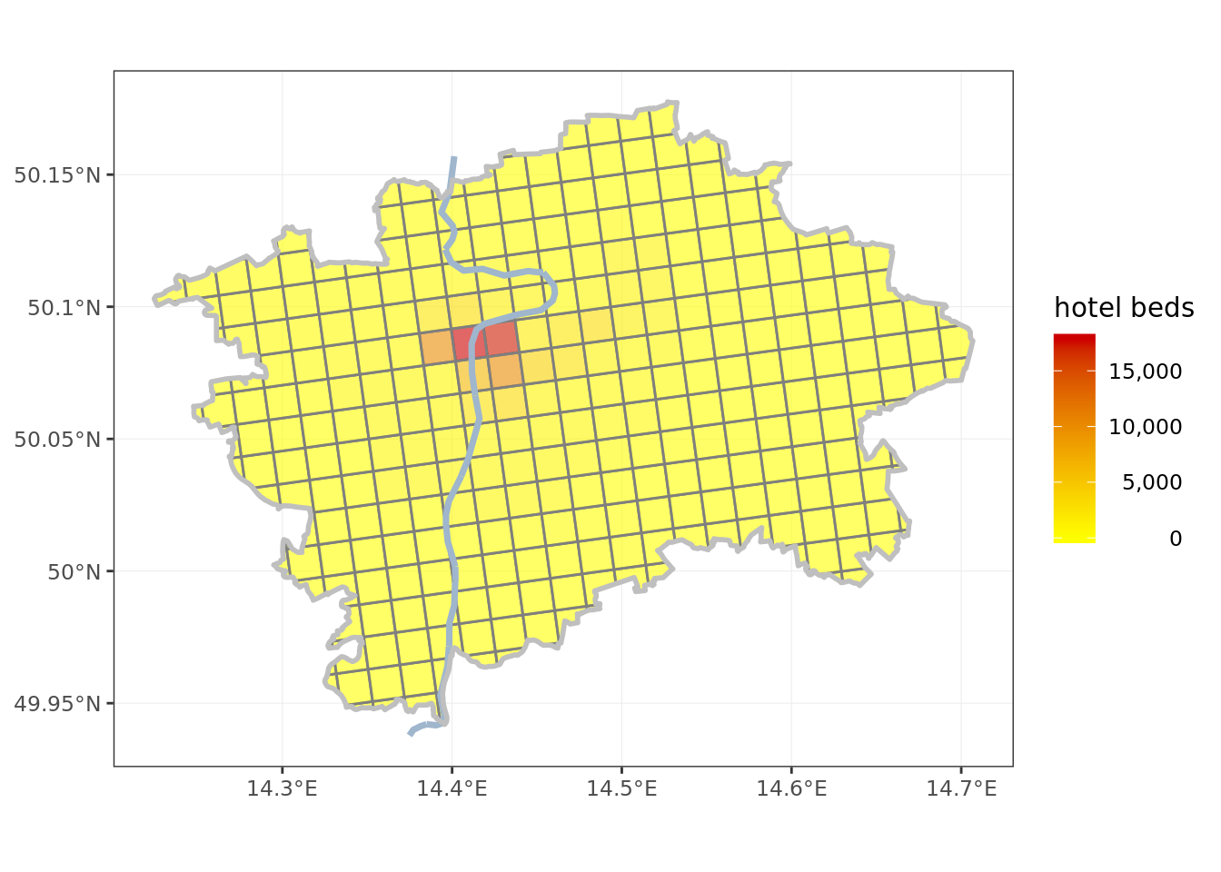
ggplot() + # plot metro stations
  geom_sf(data = grid, aes(fill = stations), color = 'gray50', alpha = 0.6) +
  scale_fill_gradient2(low = 'green2',
                       mid = 'yellow',
                       high = 'red3',
                       na.value = 'white',
                       name = 'metro stations',
                       breaks = c(1, 2, 3)) +
  geom_sf(data = vltava, color = 'slategray3', lwd = 1.25) +
  geom_sf(data = obrys, fill = NA, color = 'gray75', lwd = 1, alpha = 0.6) +
  theme_bw() +
  theme(axis.title.y = element_blank(),
        axis.title.x = element_blank(),
        legend.text.align = 1)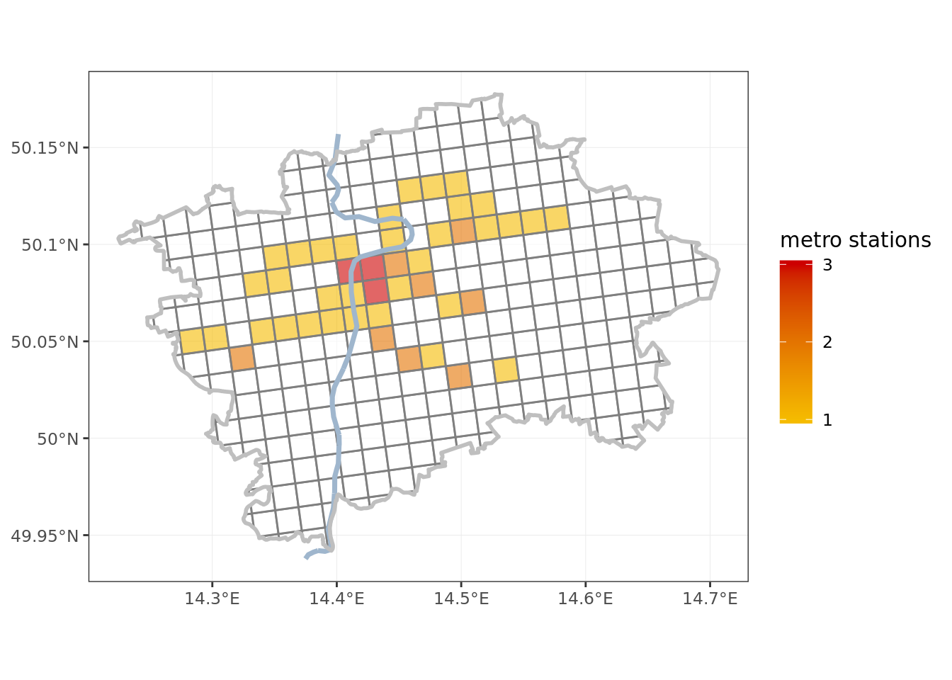
# as final step: replace missing metro stations with zeroes
grid <- grid %>%
  mutate(stations = ifelse(is.na(stations), 0, stations))
Model
Now that both target variable and model features are assigned to the grid cells it is easy to fit a model. A linear regression is a good first step.
Note that modeling is the key factor setting R apart from other GIS tools. While I am opting for a plain vanilla linear regression in this case, I could easily throw the full R modeling arsenal at the problem, if I so desired. This is a race in which the regular GIS packages, both closed and open source, are in no position to compete.
# simple does it - linear regression
model <- lm(data = grid, barcount ~ pop + beds + stations)

print(summary(model))
##
## Call:
## lm(formula = barcount ~ pop + beds + stations, data = grid)
##
## Residuals:
## Min 1Q Median 3Q Max
## -18.028 -1.430 0.150 0.733 40.323
##
## Coefficients:
## Estimate Std. Error t value Pr(>|t|)
## (Intercept) -0.7495977 0.4141490 -1.810 0.071244 .
## pop 0.0006343 0.0000874 7.258 3.04e-12 ***
## beds 0.0030737 0.0002195 14.005 < 2e-16 ***
## stations 3.0116793 0.7878523 3.823 0.000159 ***
## ---
## Signif. codes: 0 '***' 0.001 '**' 0.01 '*' 0.05 '.' 0.1 ' ' 1
##
## Residual standard error: 5.243 on 318 degrees of freedom
## Multiple R-squared: 0.6893, Adjusted R-squared: 0.6864
## F-statistic: 235.2 on 3 and 318 DF, p-value: < 2.2e-16All the coefficient appear statistically significant, and R² of 0.69 is a respectable figure for a simple model.
It is interesting that the coefficient for foreign visitors is by an order of magnitude higher than for locals. It takes 1577 Prague residents to support a bar, but only 325 foreign visitors.
As interesting as the model and its coefficients may be from the point of view of network optimalization they are secondary. We are more interested in the residuals. From differences between observed and modeled values of bar count per grid cell I can tell areas that have too high, and too low, number of bars (branch locations). This will be the key output.
resids <- model$residuals # extract residuals from model

grid <- grid %>% # ... attach them to grid
  cbind(resids)
Report the results
As this will be the main output of my investigation I will present the plot of residuals interactively, using toolset from the leaflet package.
library(leaflet)
library(htmltools)

# diverging palette - green is good, red is bad
pal <- colorBin(palette = "RdYlGn",  domain = grid$resids,  bins = 5,  reverse = T)

grid <- grid %>% # create a HTML formatted popup label of grid cell
  mutate(label = paste0(round(abs(resids)),' <u>',
                        ifelse(resids > 0, 'more', 'less'),'</u> bars than expected'))

leaflet() %>%
  addProviderTiles(providers$CartoDB.Positron) %>%
  setView(lng = 14.46, lat = 50.07, zoom = 11) %>%
  addPolygons(data = grid,
              fillColor = ~pal(resids),
              fillOpacity = 0.55,
              stroke = F,
              popup = ~label)
Conclusion
The main point from my analysis are that:
there seems to be more bars than expected in Letná, Smíchov and Karlín (locations well known for active night life)
there seem to be less than expected bars on Petřín hill (a big park by the Prague Castle) and on Olšany (a major cemetery)
the number of bars in the touristy parts (around Old Town Square) is, despite being high in absolute figures, broadly in line with expectations
Neither of these findings is particularly surprising, but this was to be expected with such a simple model. Perhaps in some future version I can improve on it, for example by incorporating information on parkland and / or building density from satellite data.
More important than the actual result is the fac that the model is in line with expectations, and demonstrates the feasibility of a more serious modeling work in different settings.